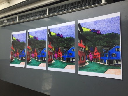
From all of my experimentation up to this point, for my final photograph I have compiled all the things I liked from previous images. This process took a long time and I will go through the steps that I undertook to achieve the final image.
- Bottom Layer, Steadtler Felt Pens
- Second Layer, Letraset Tria Marker
- Third Layer, Sharpie Pens
- Fourth Layer, Glass Paint
Firstly, I scanned, enlarged and printed my chosen picture. I chose this image in particular as it allowed for intricacy to be applied and the composition I believed was strong and allowed for me to experiment with different techniques.
Secondly, I used Steadtler felt tip pens on the original print layer to represent to original colour of the trees whilst still allowing for their detail to be shown through. I also used vibrant colours on the buildings as when doing this in my previous prints, this worked well and created a nice atmosphere when viewing the image.
Thirdly, I added a layer of acetate on top and use the Letraset Tria markers to go over and emphasise some of the colours added on the bottom layer to make them stronger. Additionally, from my experimentation of using my finger on the previous images, I decided to add texture to the sky by using the fine tip of the markers and dotting it precisely all over the sky to create this interesting effect.
Fourthly, I added another layer of acetate on top and used fine tip Sharpie markers to add in all the details that have been covered from the original picture. I used the black Sharpie marker for the majority of this but then used some coloured Sharpies for the smaller buildings that wasn’t easy to do on the previous layer.
Fifthly, I added the final layer of acetate where I used black glass paint to go around all of the edges to define them more and to create an almost 3D effect. Making the photograph almost look animated.
Sixthly, I lined up all the layers perfectly and scanned them together using the university’s high quality image scanners at a high DPI.
Seventhly, I loaded this image into Photoshop and altered the contrast to make it stronger as when scanning through the clear plastic layers, some of this contrast was lost.
Eighthly, I reprinted this image using the A3 printers at university on to Glossy, Lustre, Matte and Satin paper so that I could decide which one portrayed my image most successfully. After looking at all four of them, I decided that the glossy paper was the best because I liked how it resembled the glossy-ness of the acetate layers that played a vital role in my images.
By combining all these different techniques that proved to be successful, I was able to produce a final image that I am very proud of:
There are many things that I like about this photograph and why I am happy to choose it for my final image. I really like the transformation that it has undergone to get to this point. Especially the use of 4 different layers and 4 types of pens/paint that has made the print almost not even look like a photograph any more. But more of an artist animation of a photograph. The use of different textures has also impacted the successfulness of this photograph. The choice of colours exaggerate reality, which has been evident in all of my work up until this point. Although the majority of these colours are bright, I think that the right amount of balance has been used so that the photograph isn’t too overpowering. Additionally, I think the concept behind this image is strong and is very personal to me. The way that I have chosen an image that was my great grandfathers and coloured it, as he would have, but doing it in my own style brings me closer to him and I feel like I have made a connection although I didn’t personally know him.
I am very happy that I chose to do this as my project, I have found it very interesting and have loved to get back to using pens and paint and making something by hand as this makes my work feel more valuable to me. I have enjoyed experimenting with different techniques and this is definitely something that I would like to work with more in the future.
© Kirstie Wilkinson


